Nando’s
Global Packaging Design
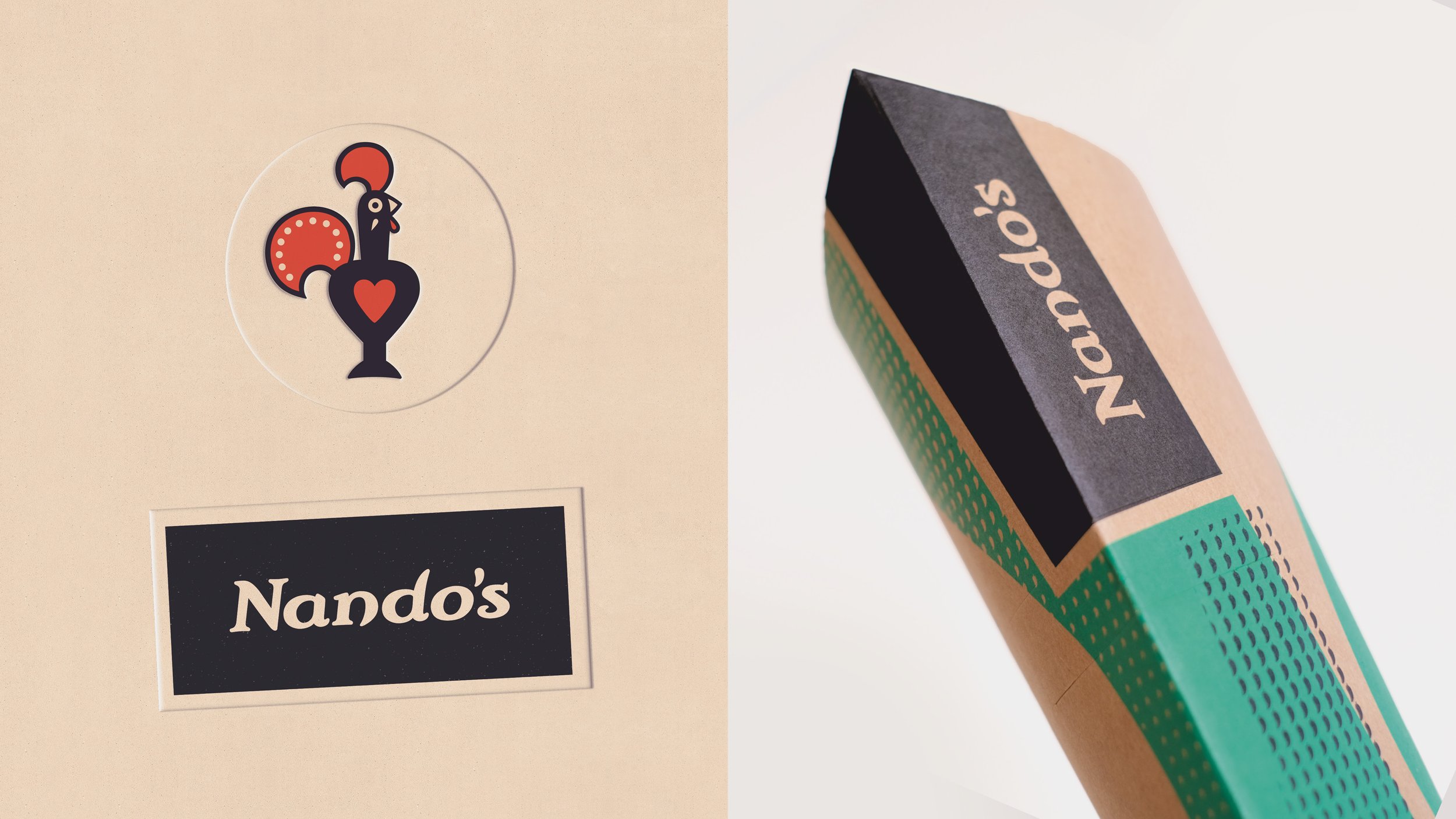
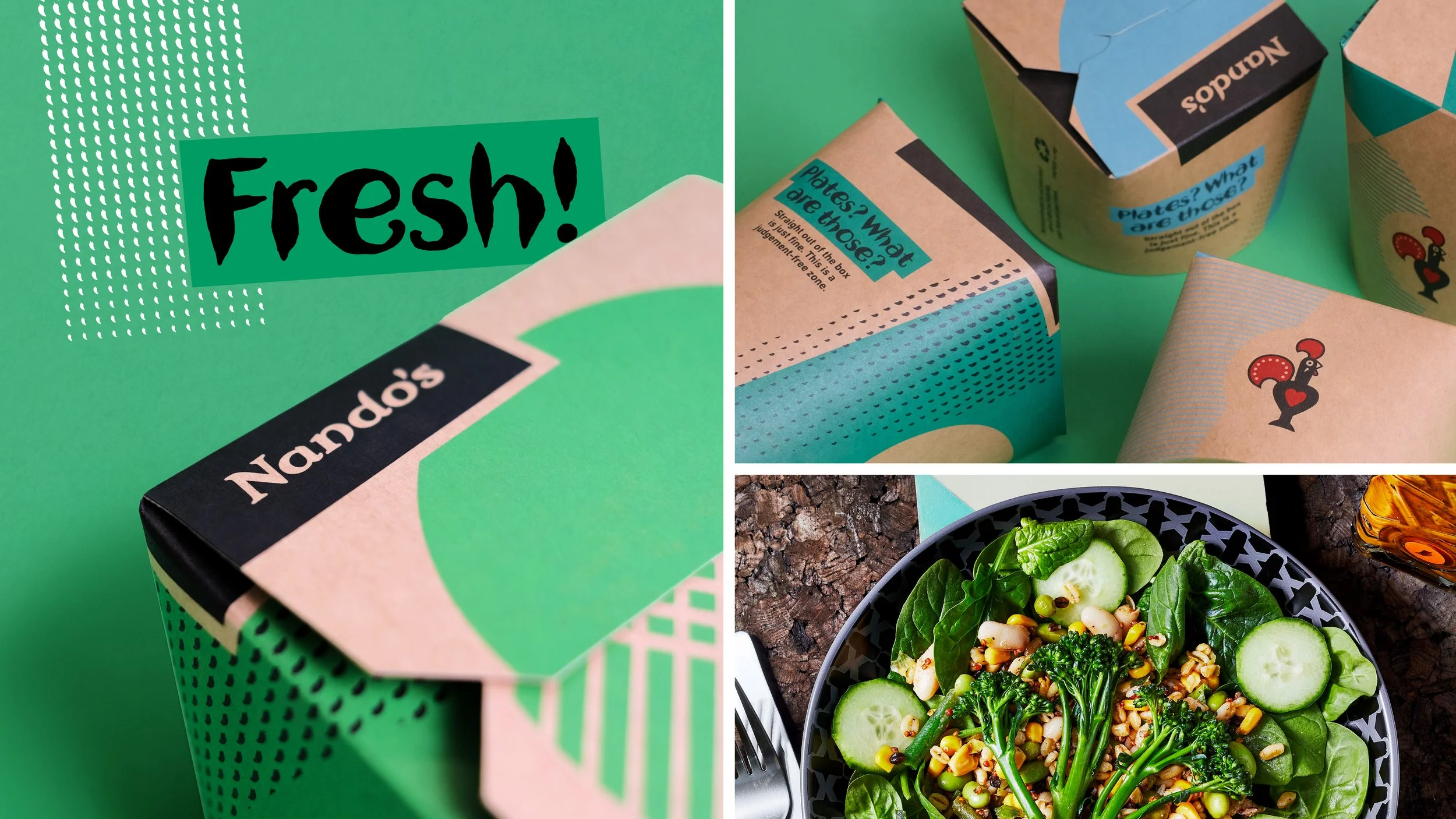
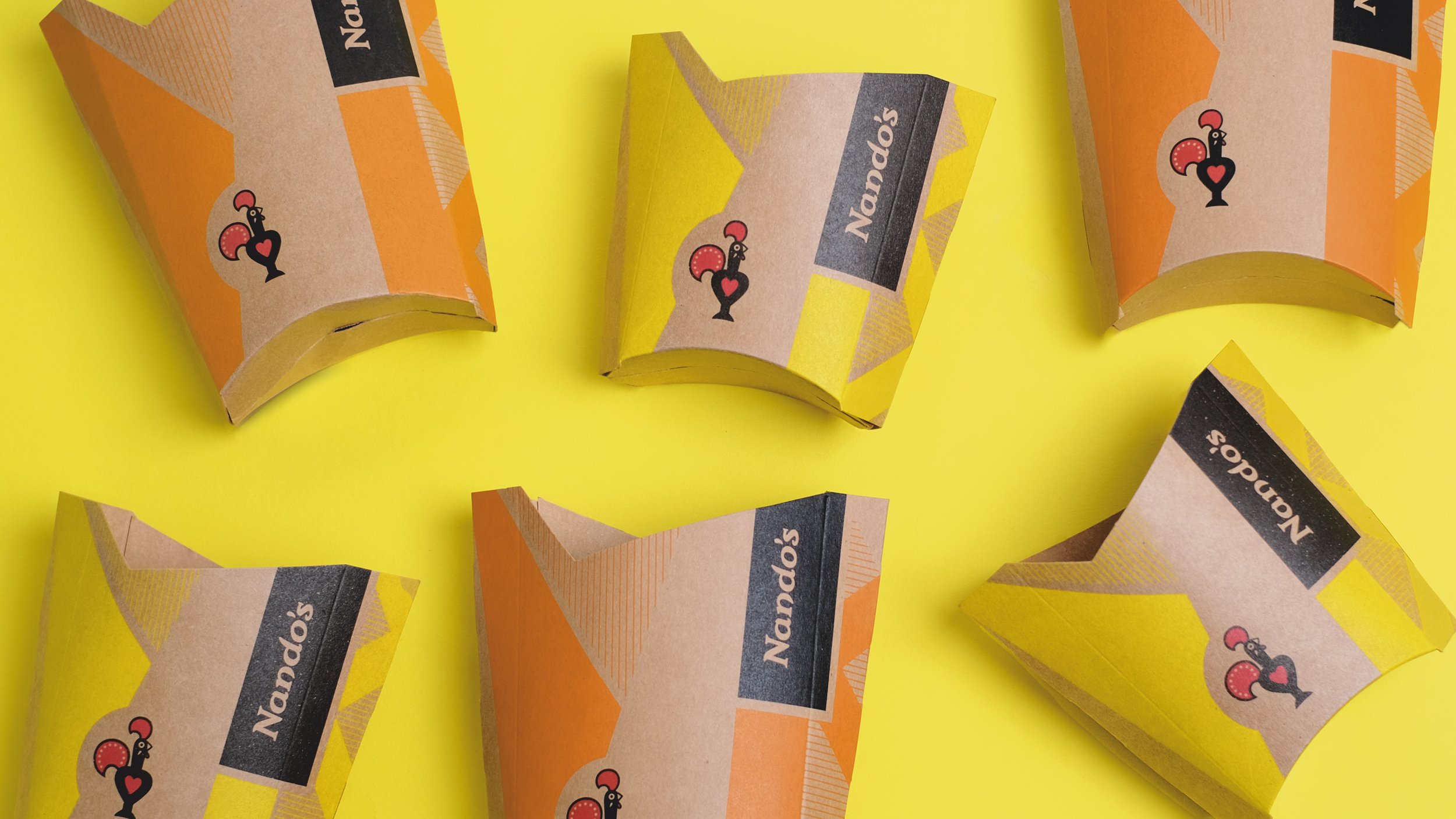
We wanted to bring some fresh, youthful energy to Nando’s global packaging. So we looked at their modern restaurant designs, food shapes and vibey Afro-Luso music for inspiration.
-
To guide the design process, we created a system of layers: Brand, Bold Beats, and Rhythms. By incorporating these distinctive elements, the packaging began to showcase the brand’s progressive and fun-loving personality more boldly.
We also crafted the inner packaging to reflect an in-restaurant environment, and the outer packaging to reference their restaurant exteriors. The result: authentic excitement inside and out.
The new look is now rolling out to global markets including The United Kingdom, USA, Australia and the United Arab Emirates.


